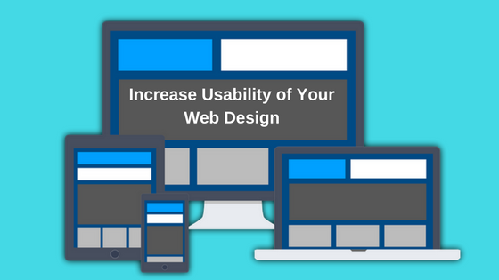
Do you run an e-shop? Are you not getting leads equal to expectations? Despite spending thousands of dollars on CPC or PPC campaigns, a renowned e-shop can fall flat in view of making ultra-profit. Sometimes, our wrong selection of keywords proves culprit in this game but not always.
So! What can be the causes playing dirty game of retarding leads and thereby, profit? Ok, let I drop you a clue. Have you checked the layout of your website?
Many naïve eCommerce businessmen turn blind eye to the structure of their website. It can be full of flaws. Yes! It can happen to anyone. Even, you and I are included in such category.
Being a part of web development and digital marketing team, this fact dawned at me. I was surprised but indeed, I learned a lot. Now, I can explain what the main troubling zones are. Walk through the points mentioned here to get intensive insight.
Self-Explanatory Design Wins!
I witnessed a flaw in a cosmetic brand. Once an item was clicked ‘Add to Cart’, I as a user found no clue to further my purchase. I moved the cursor all over that page but no message was seen until I clicked ‘Buy Now’. But later, it was corrected. A Shopping cart tab designed at the top bar was popped a window with the checkout option.
All I want to convey is that the web design must be self-explanatory. Make sure that all actions must be in loop hierarchically. Alternatively, you can design a pop up against every clickable action for instructing the user.
Avoid what users hate!
Web world has multiple answers against single query. What else than the SERPs can explain it! Searching a keyword in SERPs displays many relevant webpages.
Users are impulsive. If any website fails to douse their searching appetite, they will not wait for more than a few seconds. They will hurry to say ‘bye’ and move ahead to some other pages. Perhaps Google has premeditated this issue intensely. This is why it offers multiple results.
Webpage designing and filling a form in a website need expert’s talk. If any activity, like uploading, on the website proves time-consuming, the users switch to another website.
Scrolling down & down? It’s irritating!
Designing a long page is not a wise trick to linger the users longer. Rather, it’s better to make its features clickable. How boring it would be to scroll down and down in search of a specific product or service! What if dragging down the mouse infinitely results void or zero? The user somewhere in heart feels such scrolling is mere a trick to trap for staying longer.
Moreover, it becomes the height of user’s endurance when ads or subscription message pops all of sudden. He has to wait until it vanishes itself within a few seconds. These are just misleading tricks for reducing bounce rate of the page. So, avoid it.
Populate with prominent ePayment merchant!
The users hate such e-shops that offer limited payment options. Suppose a website has a gateway accepting e-payment through debit and credit cards of SBI, HDFC, Axis & City bank. But there are millions of users who have their account in oriental bank, American Express and many more. How would they pay? To prevent migration of such users, wallet integration is a wise option.
The merchant, like Paytm, provides wallet integration. Check before deploying outsourcing web design services from Indiaor any other country how many banks have been integrated with the payment merchant. It will be a plus.
Call the tester!
Testing the designed website removes errors. Check its dynamic web designbit by bit. Observe its loading speed and compatibility with multiple browsers. Check all the links and urls if they are working.
Examine the hosting server and its security aspects if it is on http or https. The latter IP resource marks secure. This is why Google recommends the latter, i.e. https which influences the ranking also.
Counter test it like a user, not as a web developer or designer. Suppose a traveling website offers its services at a specific place but its dynamic form accepts all places without any notification of its service areas. It would be an error. So, check it like a layman.


