Is it fruitful to promote a product or services without its tag? Obviously not! So, how do people recognize a brand?
Well, a logo can answer it perfectly. It’s a brand representative. It actually helps in brand recognition. One can easily deem a particular brand among variable names with it. This is why the search engines, too, have designed their iconic representative logo. Becoming a buzzing name is easy-n-effortless with it.
Google gets 50 billion views a day! What’s the secret that attracts huge traffic towards it-have you ever thought? There are so many other engines for search also. But why is it at No.1? It indeed imparts knowledge in the form of information that is actually the valuable, precious, unique, and effortlessly accessible food for its seekers.
Web-designers can learn a lot of logical designing from it. Let’s focus on what’s so special and unique in it that has made it an ideal source of inspiration for them.
1. Distinctive logotype:Uniqueness counts. It matters a lot since it carries a sort of information that was not revealed before. Don’t confuse it with invention. The old can have something exquisite that has not been brought to light till yet.
The new logo of Google is an outcome of evolving new from the old that must be simple, clear and friendly to various digital platforms. Its web-designing team brainstormed immensely. Thereby, it picked san serif font for logotype (which already exists). It perfectly retains the solid six colours of the old logo. (However, some assume it the style copied from ‘Party City’.)
The team focused on its size, and legibility that can fit in the frame of all digital contexts. For keeping it in-screen and printable, it worked on spacing, clarity, redline specifications and its lockups.
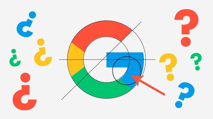
2. Wearable for future apps & systems:The Google ‘G’ is chosen for making it light-weight icon. Thereby, it can share the screen with other web elements. Its circular shape and colour contrasts are selected since the eyeballs can notice it without putting extra efforts in one go.
3. Efficient teller of user’s action:Its designing team picked four main colours for indicating what it does against the user’s action.
Let’s say, when its four dots form ‘G’, this action determines Google-in-action. The light swirling dots identifies listening to; frequency waves tells what the speaker speaks; revolving dots demonstrate thinking; repelling dots from each other while revolving show it’s replying; their to-and-fro movements define its incomprehension; instant downing dots show confirmation.
4. Optimal blending of colours: The four solid colours, i.e. blue, red, yellow and green, complete its elemental logo. All these colours are melted to complement one another. No white space is left for distraction. They are brightened to keep its vibrancy alive.
5. Distinctive font style:Neutral consistency must be there when the font style is selected. The text must look identical from geometrical aspect. This way is the best method to identify each character distinctively. The search engine applied this logic while crafting its own one.